KILIM RUG STORE INTERIOR AND FAÇADE DESIGN
Branding Design and Interior Design
For this project I redesigned an existing space into a retail space. The space needed to present the product in a new and creative way that would interest customers but still function well with displaying the products. For this I choose Turkish rugs as the product, my end goal was to have a retail space that combined the function of selling rugs with the look and feel of being in an art gallery.


Social Media
Branding Aesthetics


FAÇADE
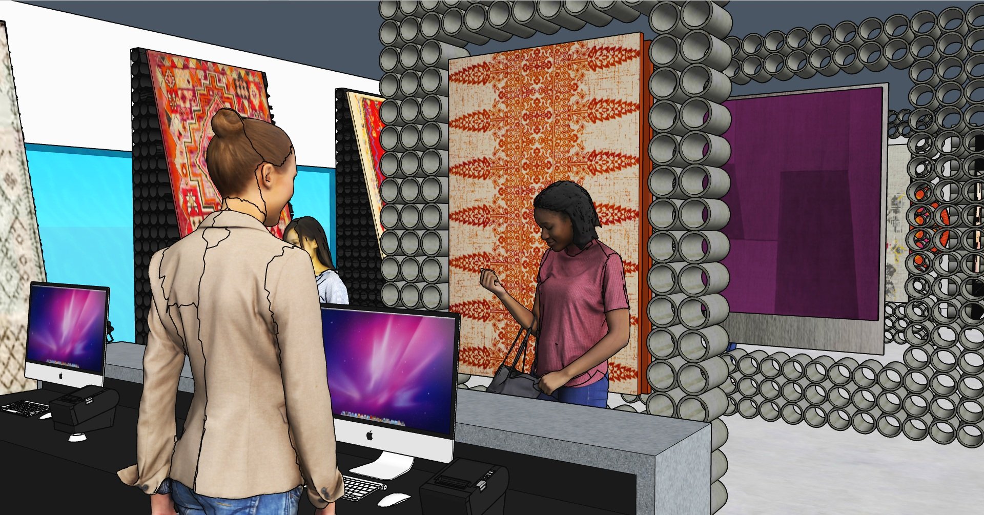
This new store front facade design would work the inside design to display some of the rugs to people walking by with out the need for new window displays. The rest of the surrounding surface area would be covered by Corten steel tubes in front of the windows given an interesting new facade texture and look that reflects aspects of the new interior.
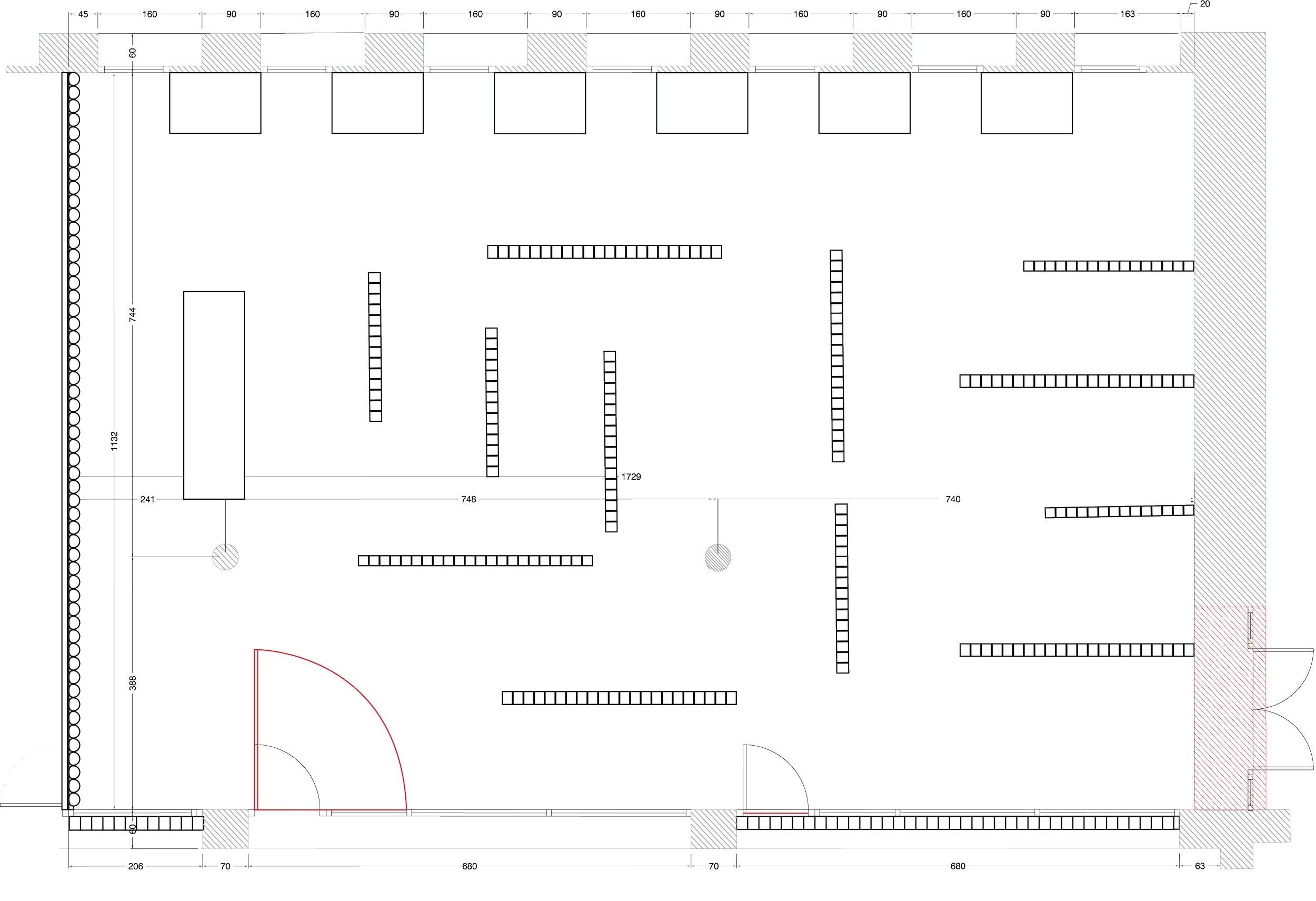
FLOOR PLAN
PRocess


For this project I choose Turkish rugs as my product to sell because of their ornate detail and quality that to some are just as beautiful as painting. I also based the design around blackened and corten steel. I choose steel as the main material because of its multiple forms and usage.


Off of my 2D designs I was happy with the design of the facade and light and steel accent wall. I was still on the fence on the floor plan and the some of the steel displays.


Once I started building out the space in sketch-up I decided to stick with consistency and just do steel walls and rams to display the rugs and got rid of the tables and cases. This allowed for more rug viewing areas and made for a better flow through the space.


