ROME GROCERY STORE REBRANDING
Branding Design
Rome Grocery Store is a locally owned convenience store and restaurants located on Mt. Baker Highway in Washington. They focus on serving the community and visitors, providing locally sourced food and products along with basic grocery and farm goods. They are a small 100 year old business that needed a new logo and brand that would better promote their current business a long with reflecting their history.

serving you delicious, Farm Fresh, & local since 1915
-

#3B4F50
R: 59 G:79 B:80
C: 76% M: 55% Y: 56% K: 36%
-

# 203133
R: 32 G: 49 B: 51
C: 76% M: 55% Y: 56% K: 65%
-

#F47A63
R: 244 G:122 B:99
C: 0% M: 65% Y: 60% K: 0%
-

# F2E8DA
R: 242 G:230 B:216
C: 4% M: 8% Y: 13% K: 0%
-

# FFFFFF
R: 255 G:255 B:255
C: 0% M: 0% Y: 0% K: 0%

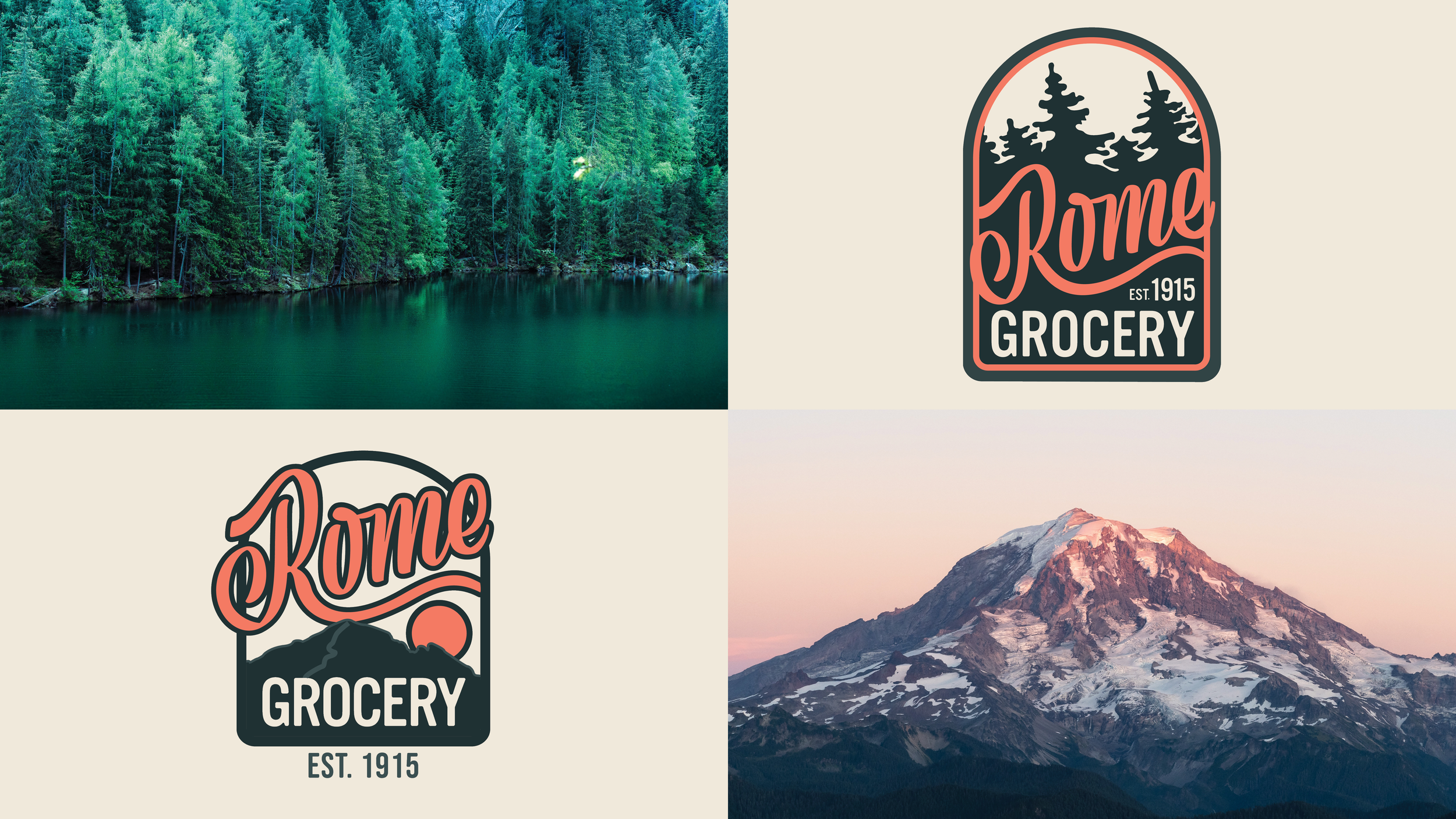
patterns and imagery
North Cascade
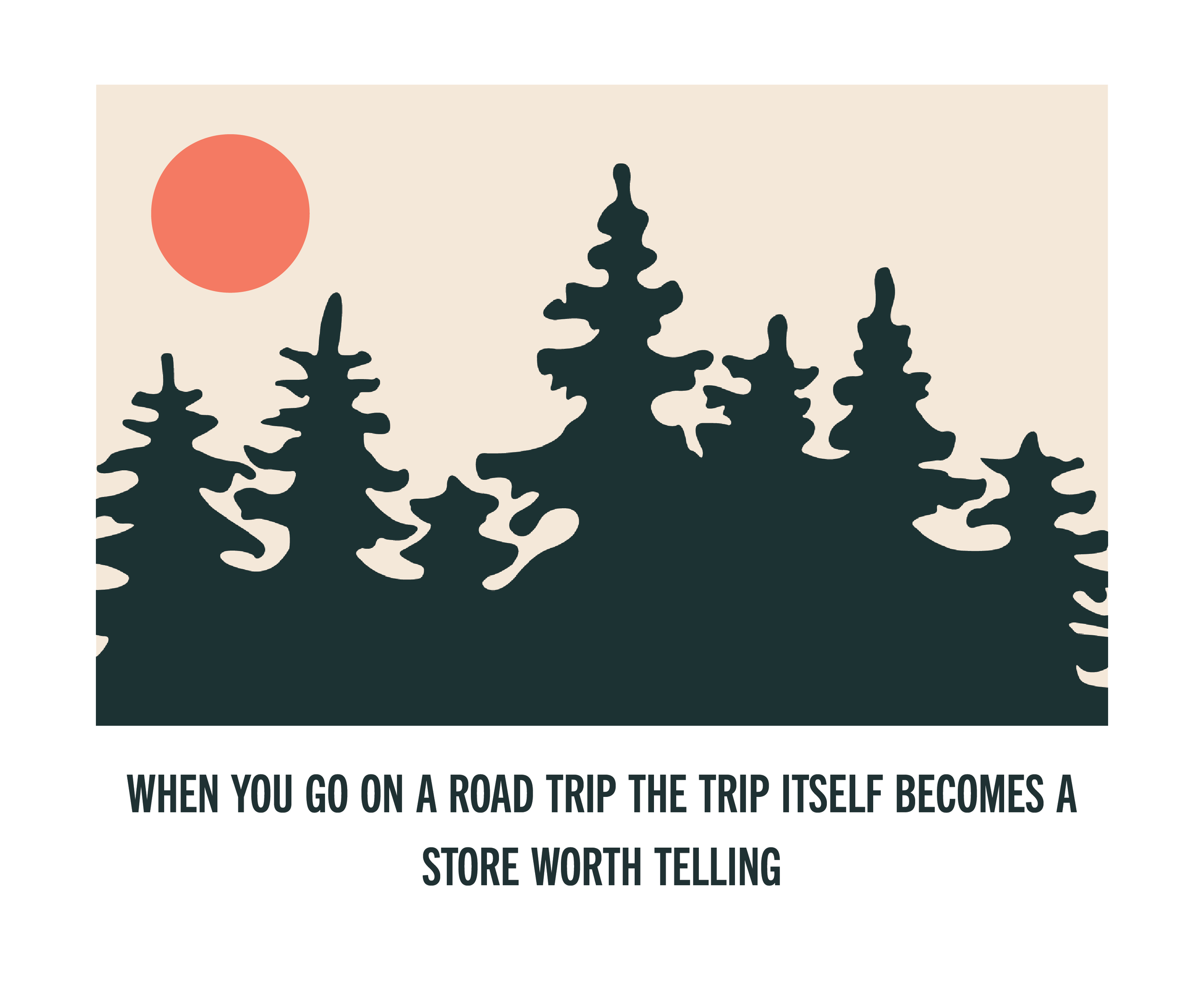
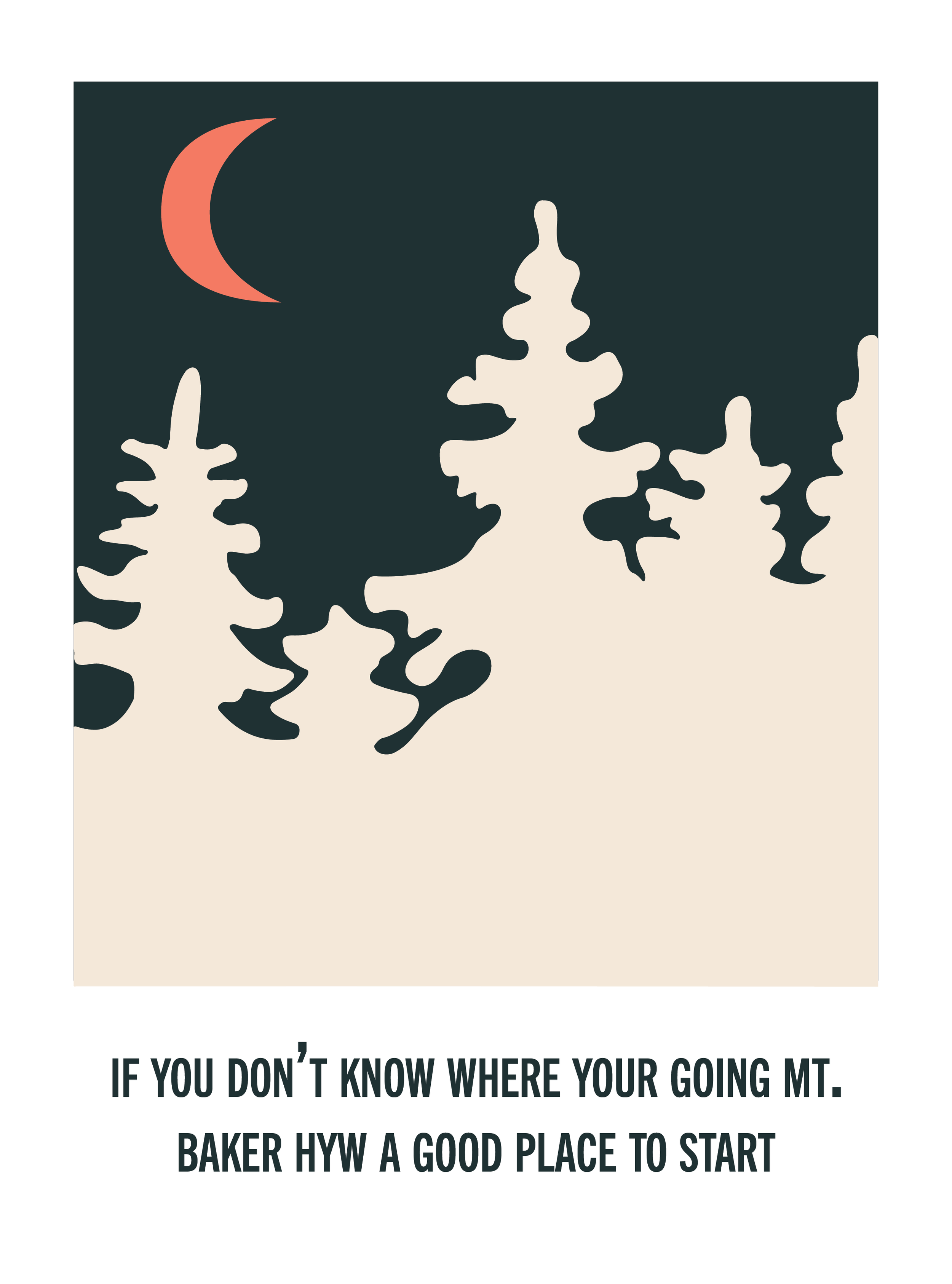
Pine trees that are found all over the West coast of Washington State
Lines found on the Mt. Baker Highway
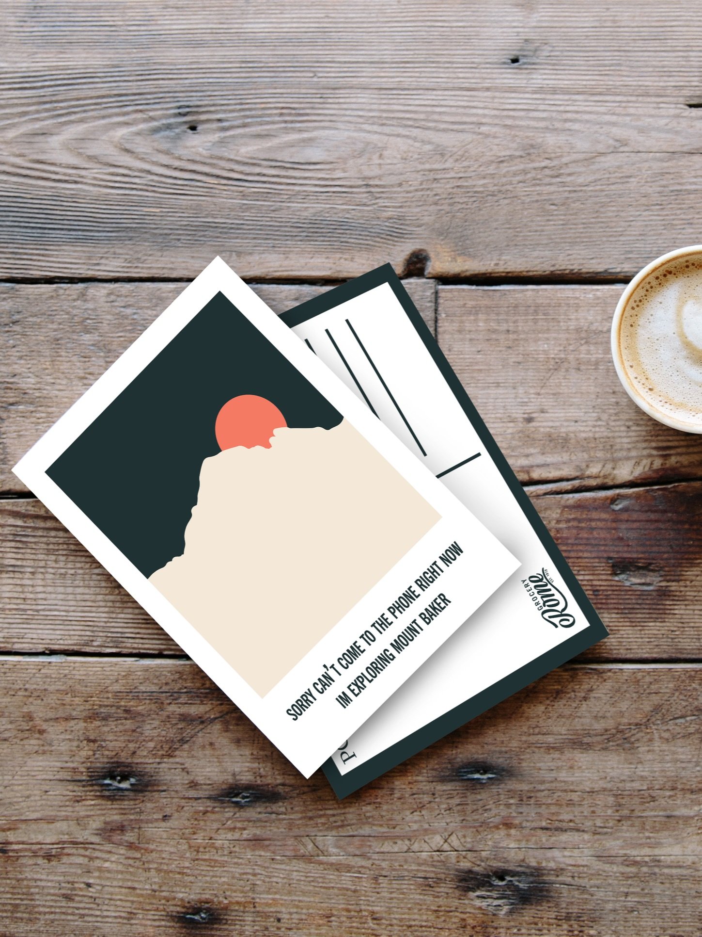
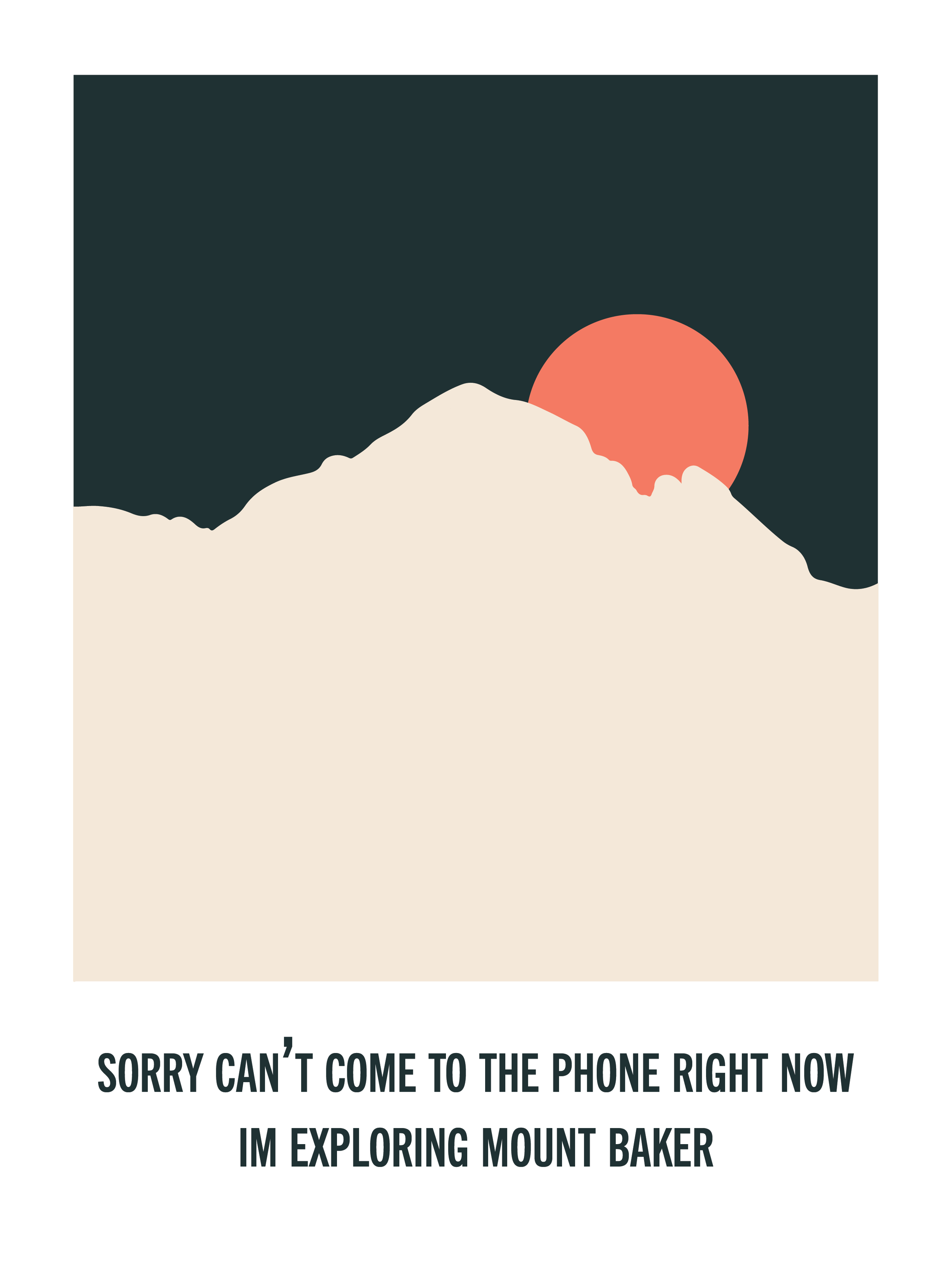
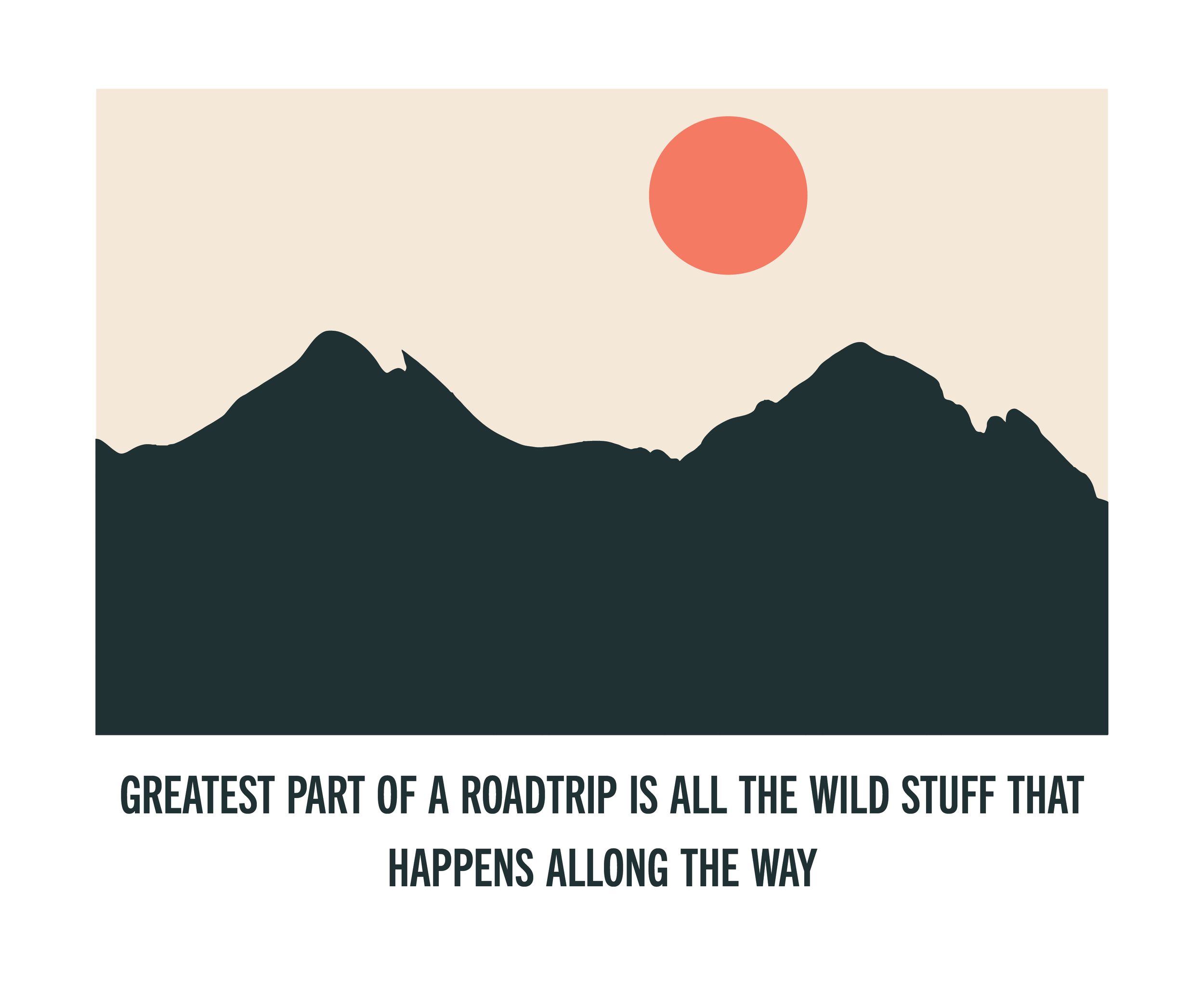
Rome Grocery store is located on Mt. Baker Highway. The patterns and imagery are meant to reflect that environment.
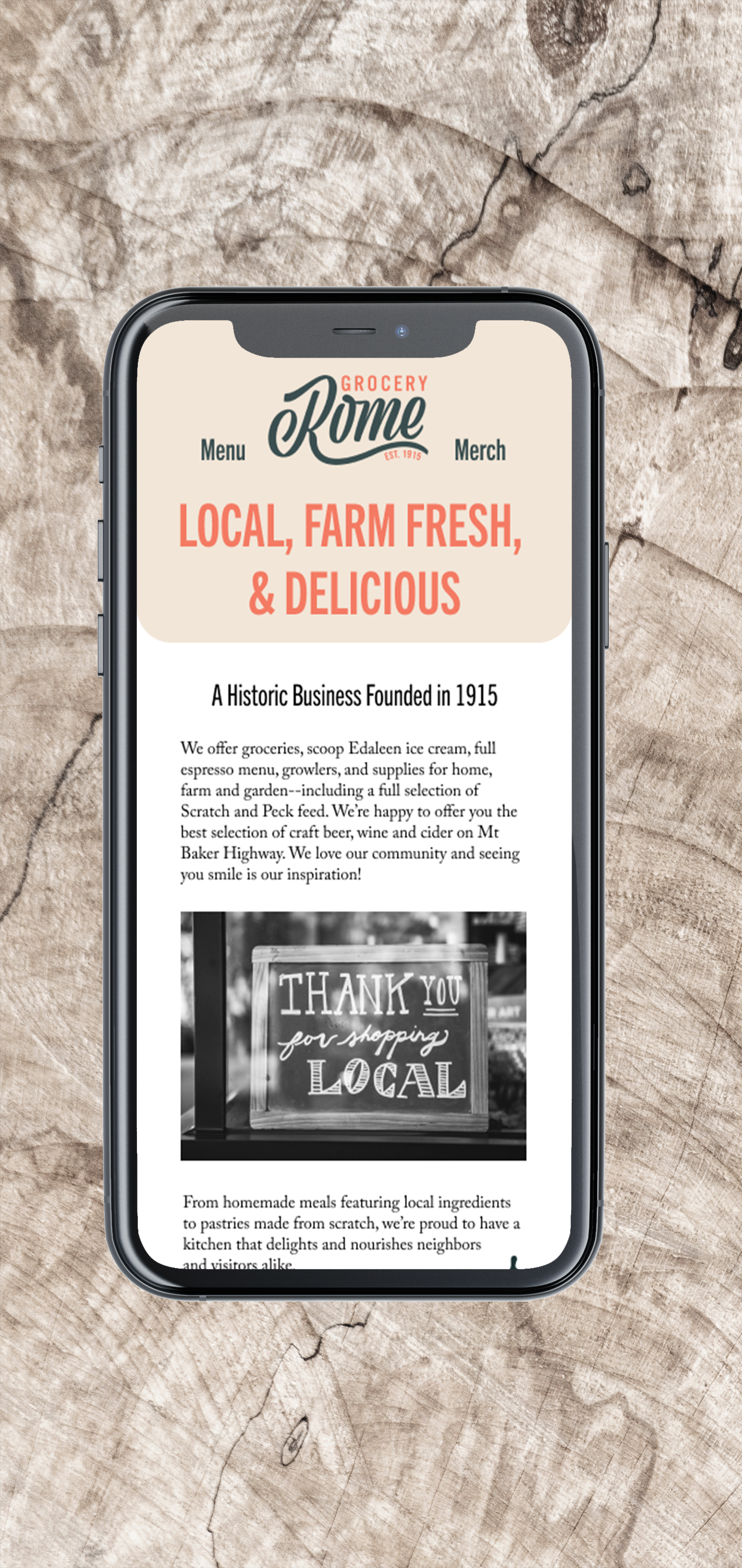


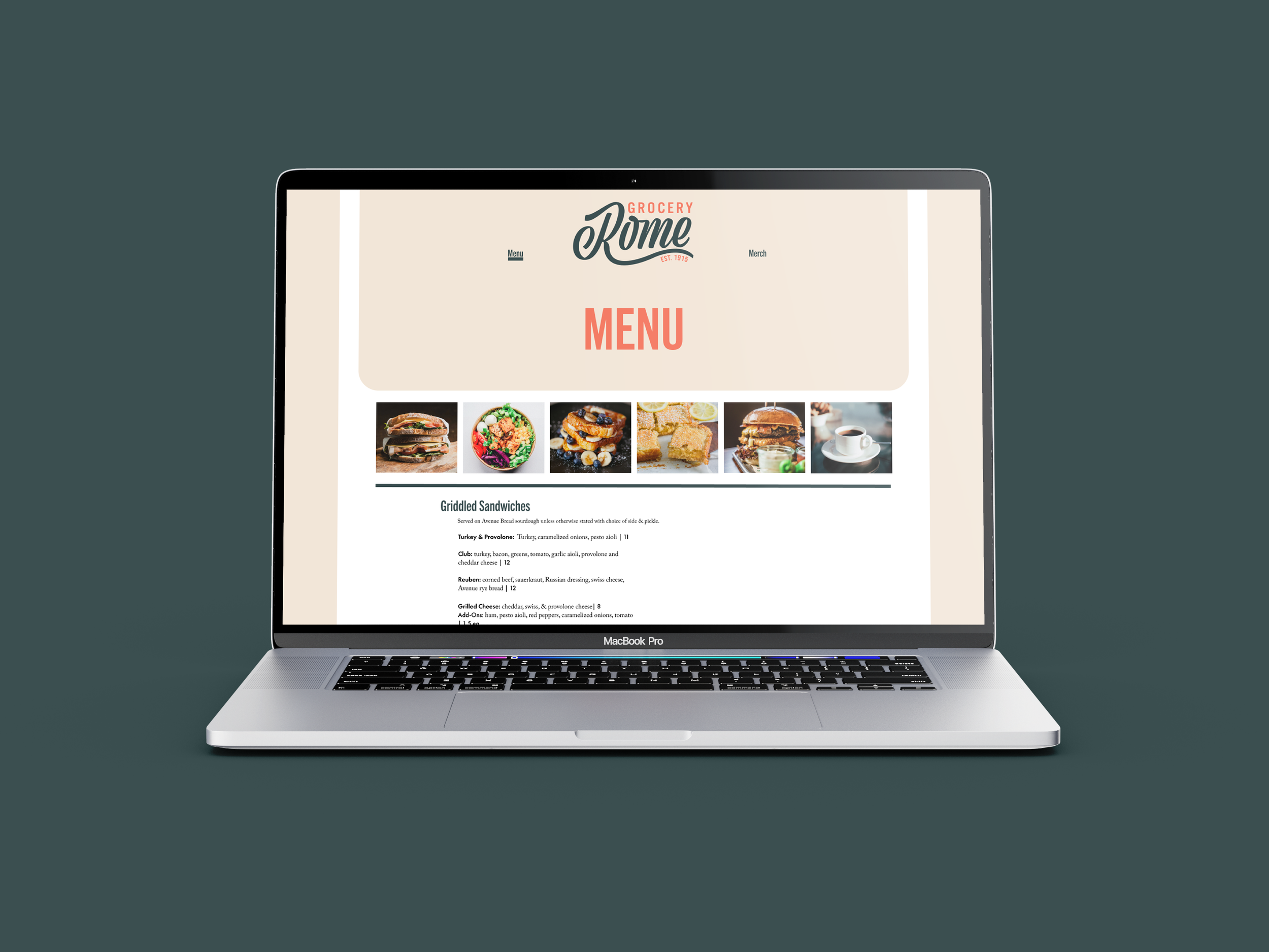
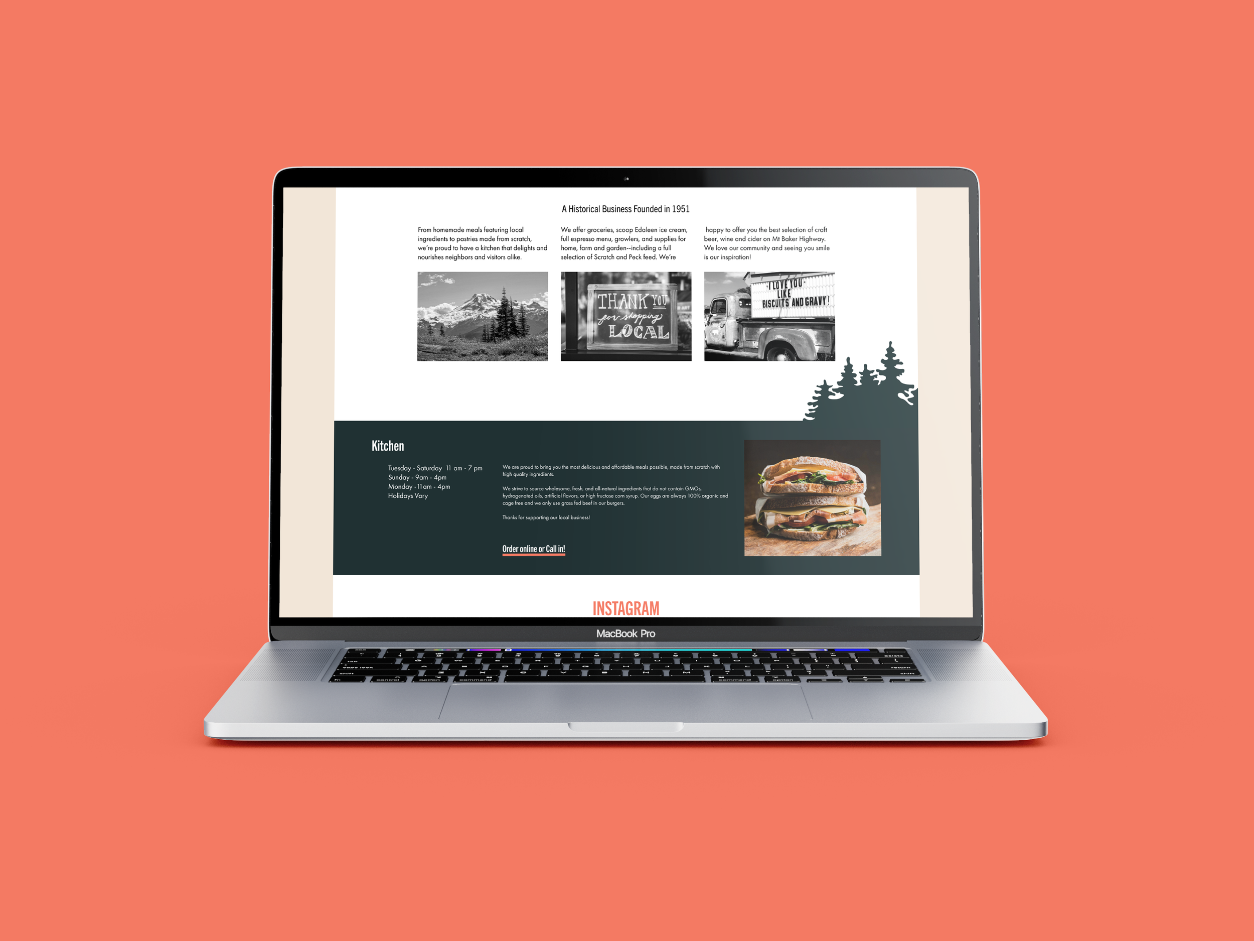
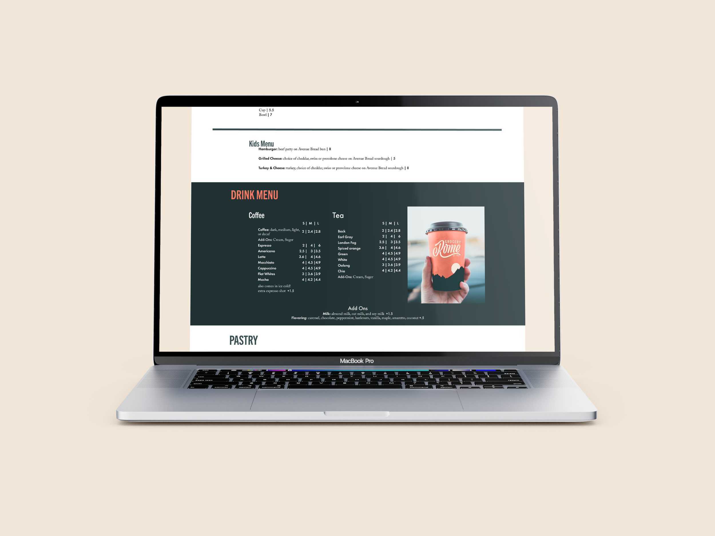
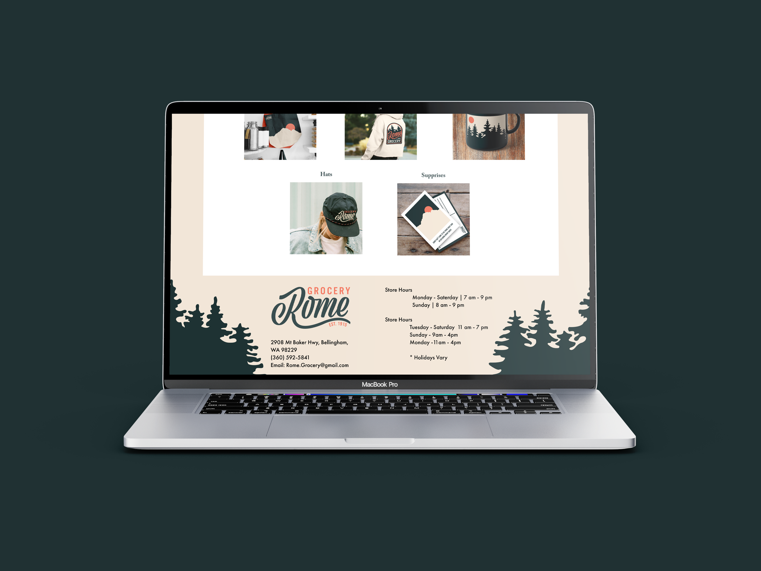
I redesign Romes website in oder to have a more user friendly mobile version and for it to match the new brand design. I also wanted to add a platform that would promote their new merchandise.
STREET SIGN
food, drink, & groceries
The design for the togo cups are meant to represent the area surrounding Rome Grocery Store at different times of day.
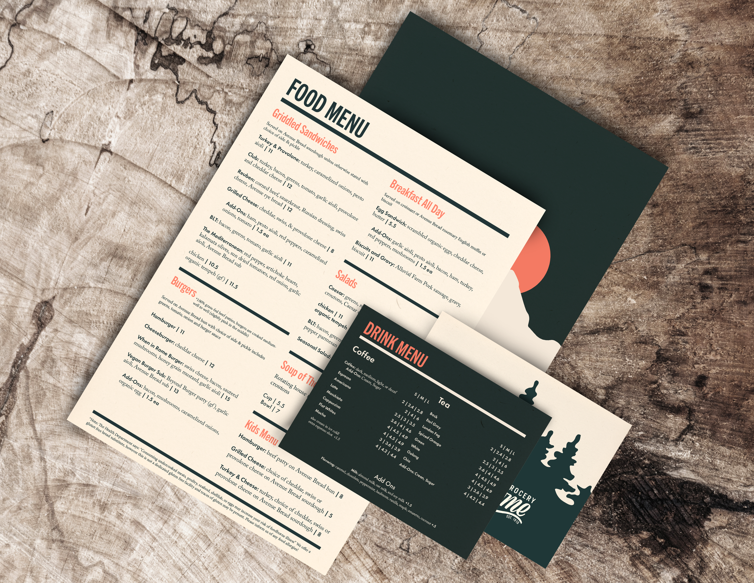
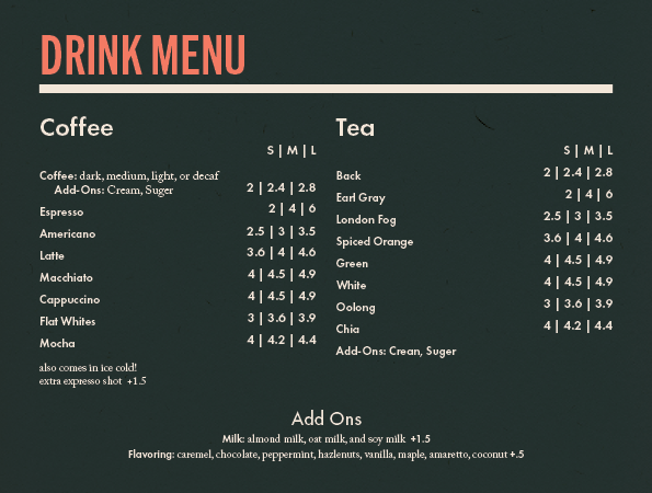

MERCHANDISE


Process
Rome Grocery’s (2021) Logo


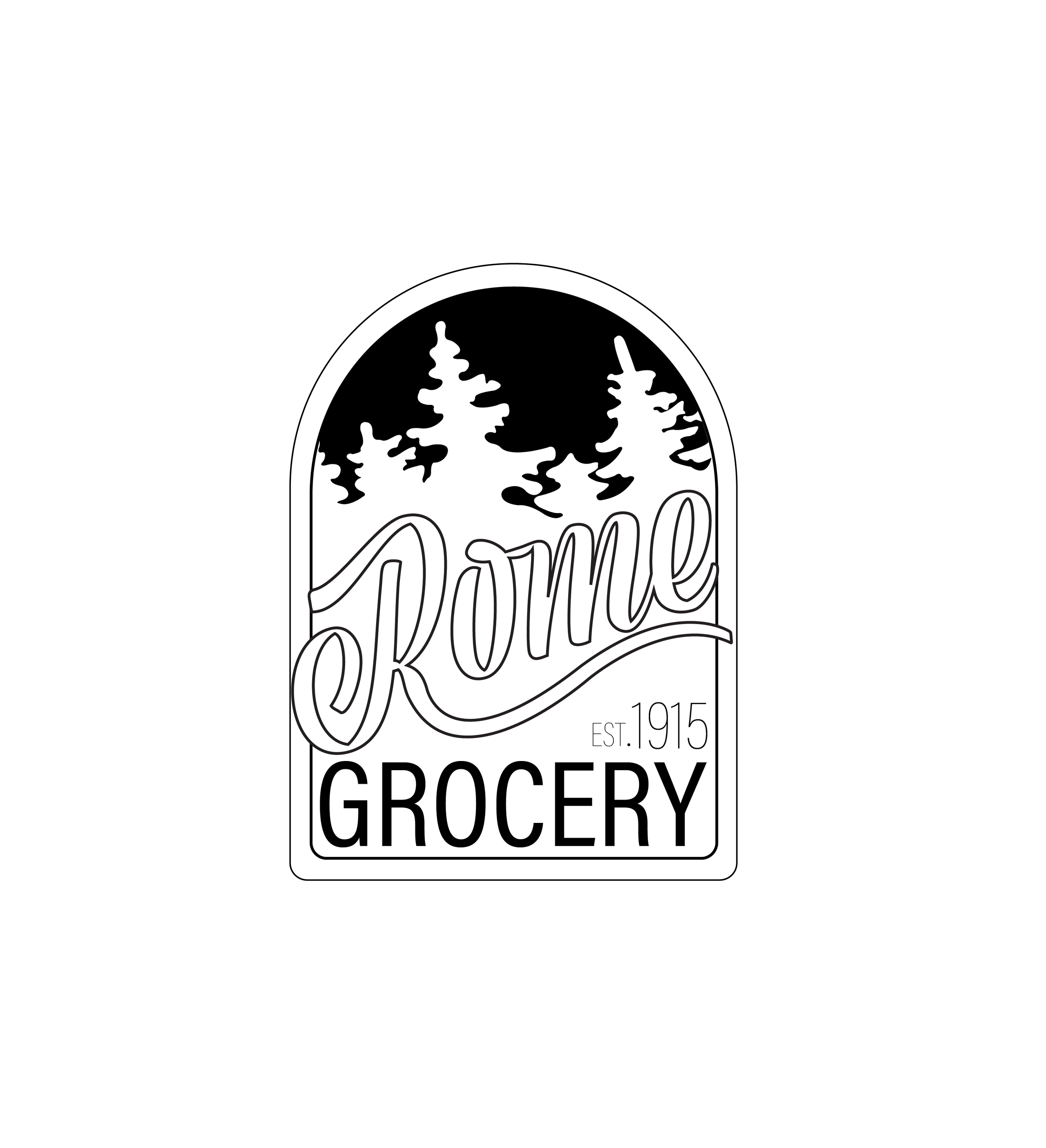
After deciding on which Sketches I thought would work the best. I started to work on making them into digital form. I fond two existing type face that I then transform to work for my designs. I used Viktor Script and Trade Gothic.




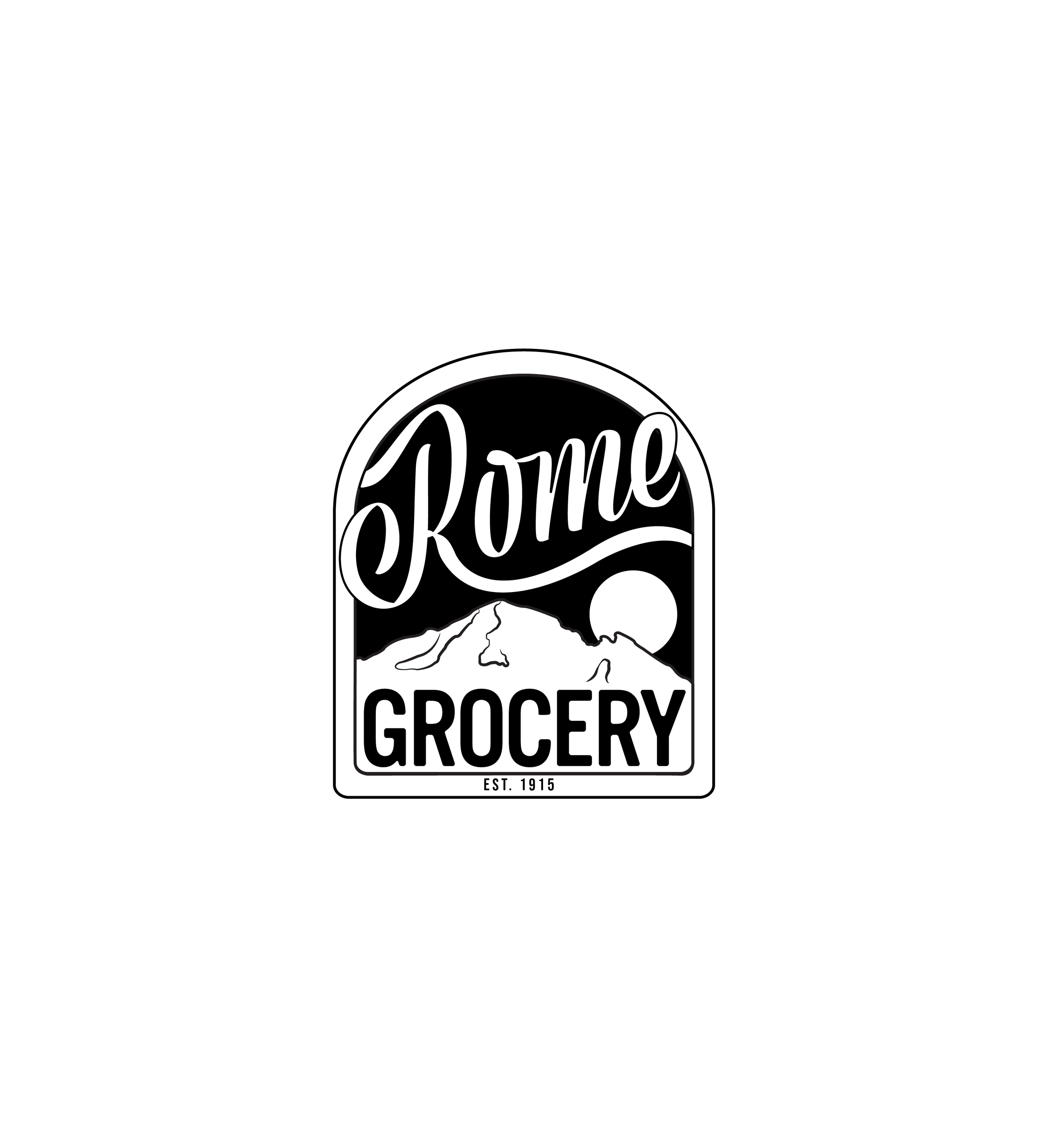
Once I had the design I wanted down and clean I moved on to color. I wanted something that would be fun and reflect Romes concept.
