tom's of maine kids Toothpaste
Packaging and Logo Design
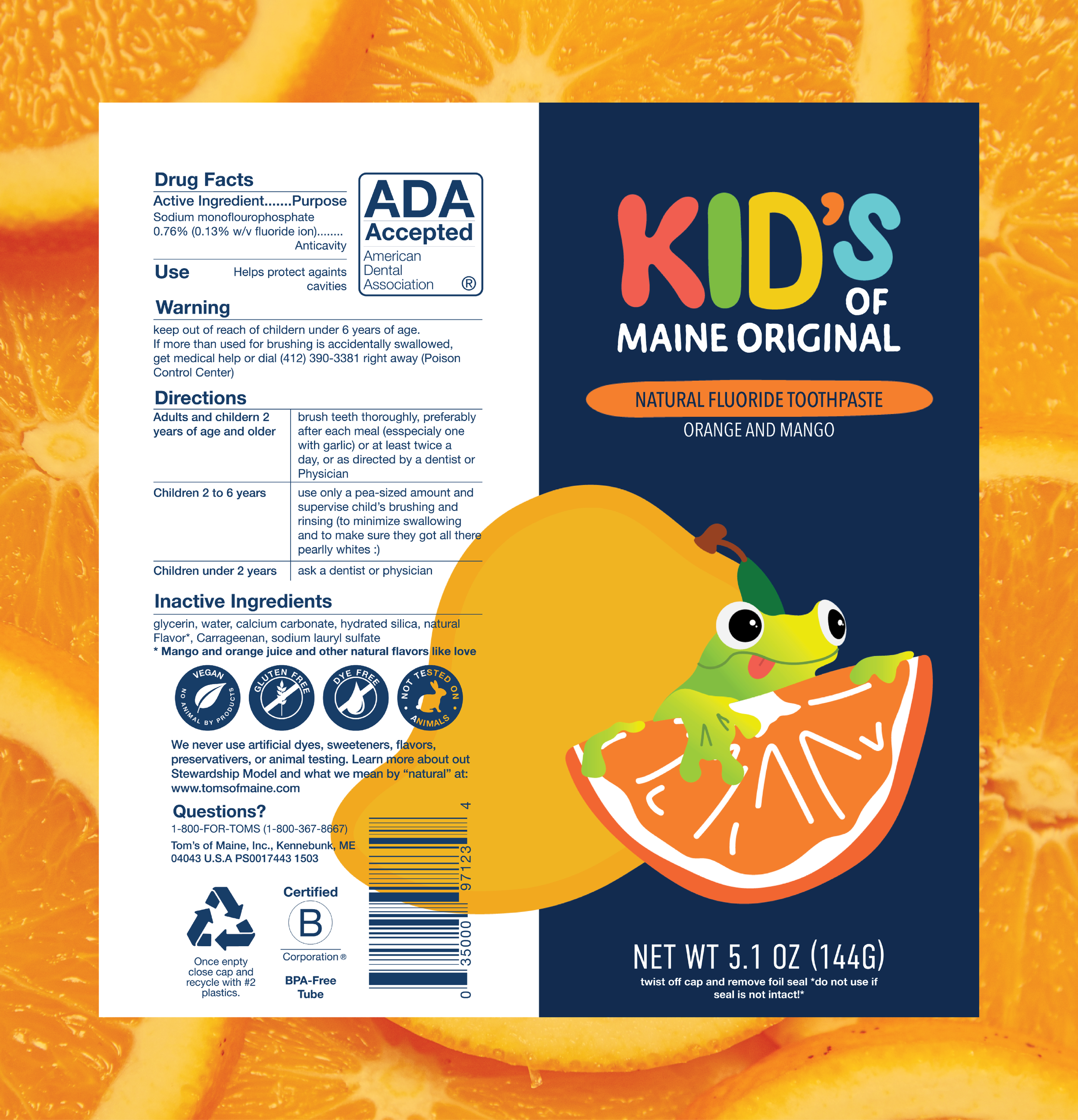
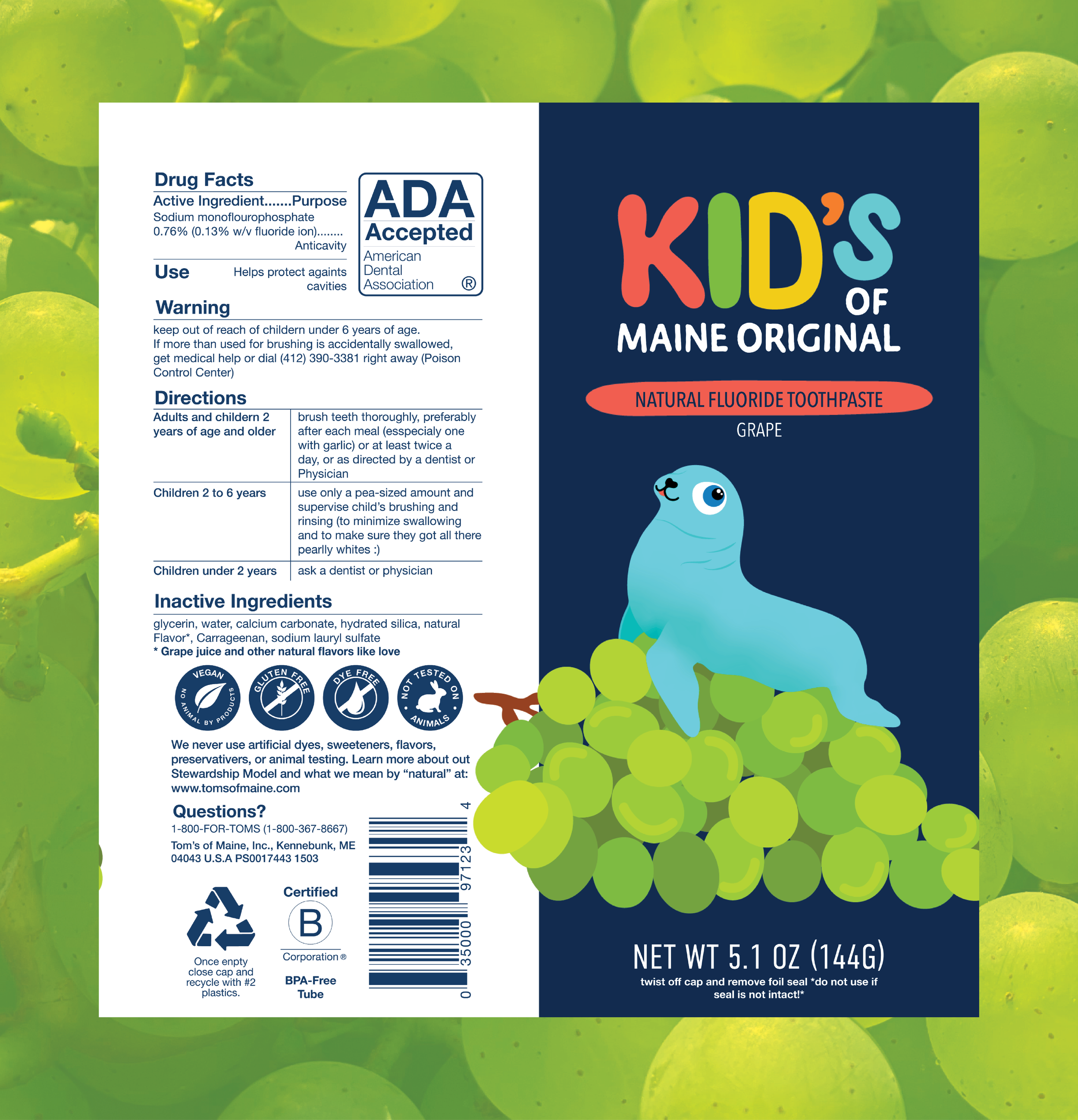
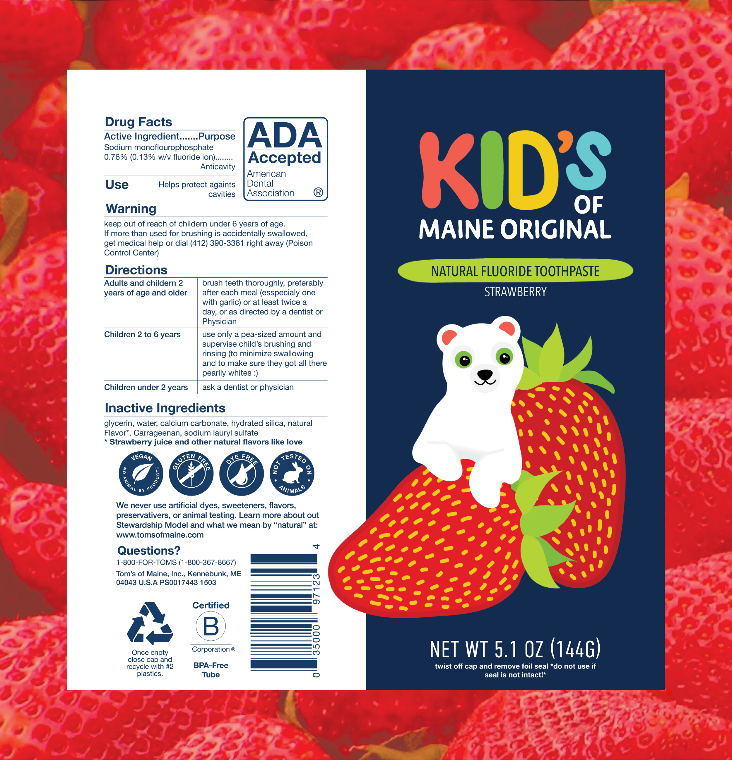
For this project I redesigned the packaging for Tom’s of Maines kids toothpaste tub. I felt that it could be made more attractive to kids while still reflecting their brand. For this I wen’t about it as though they had a sister company just for kids, which I made a new logo for below.
Tom’s currents has two types of toothpaste packaging designs. One has the fruit with illustrations lines of faces and another with an illustration of an endangered animal which they are doing in a team up with the WWF. I wanted to combine these two visual concepts and have them play off each other.
My goal was to have a bright and fun illustration what would stand out on the shelf to kids and parents while still keeping to tom’s quality.
While choosing the animals I wanted to do for this project I remember when I nannied I took the kids to the zoo and found that they were more interested in the reptiles than the other animals. So this frog is for all the kids who like reptiles.
Processs
Tom’s of Maine Current (2022) Kids Toothpaste Packaging Design
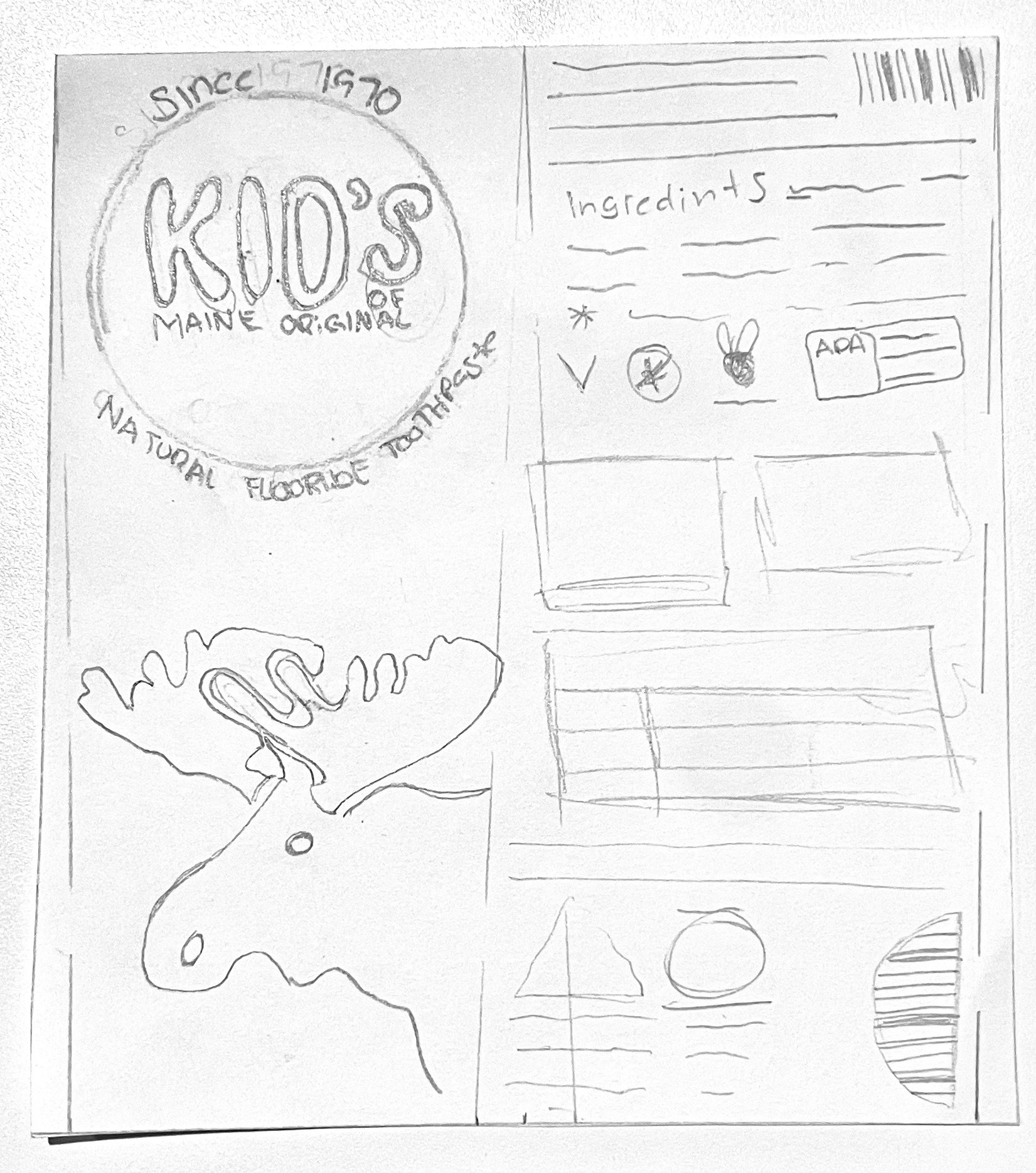
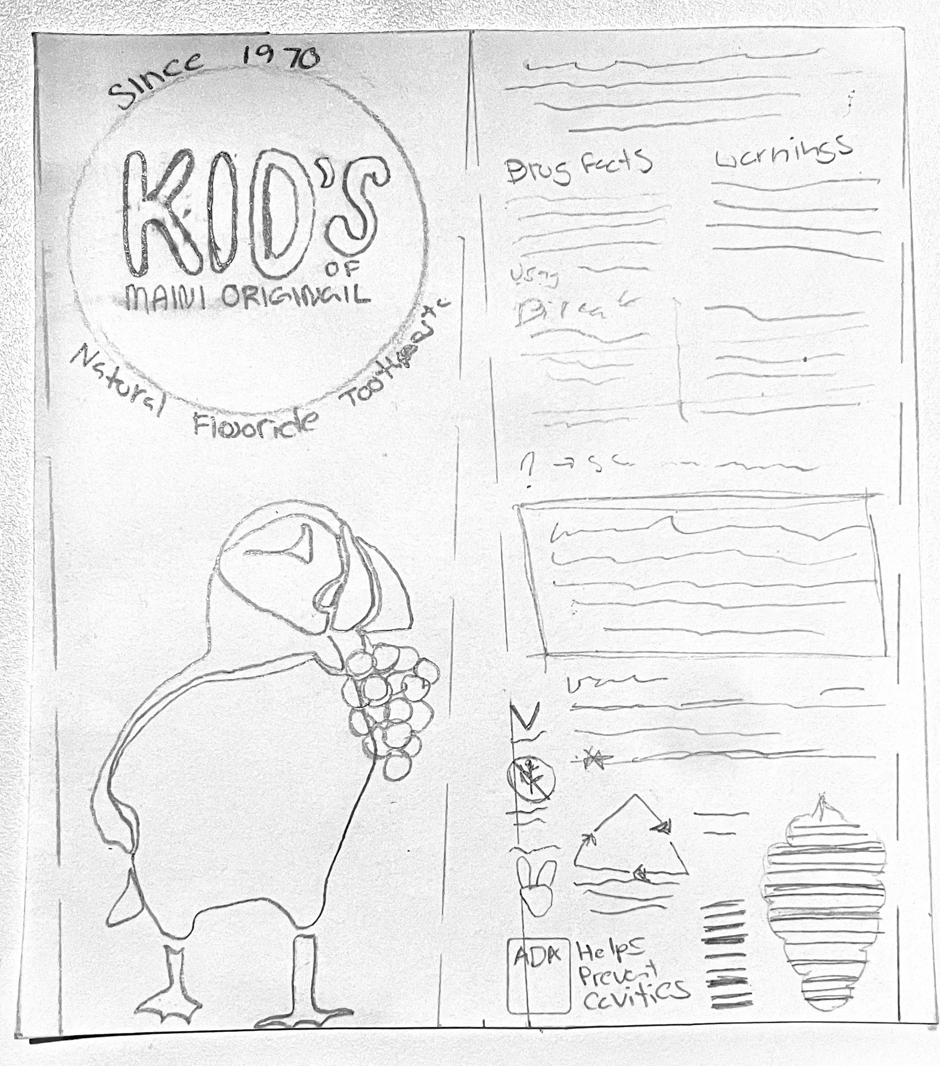
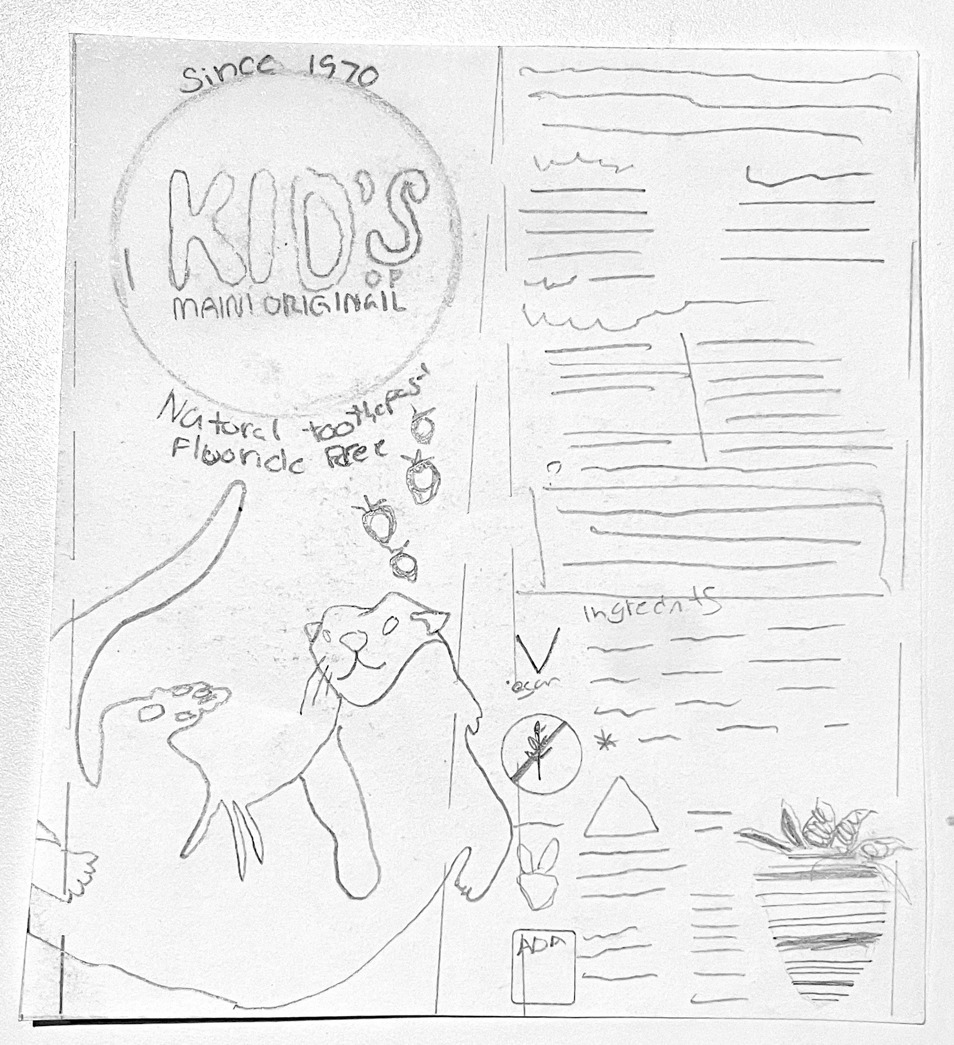
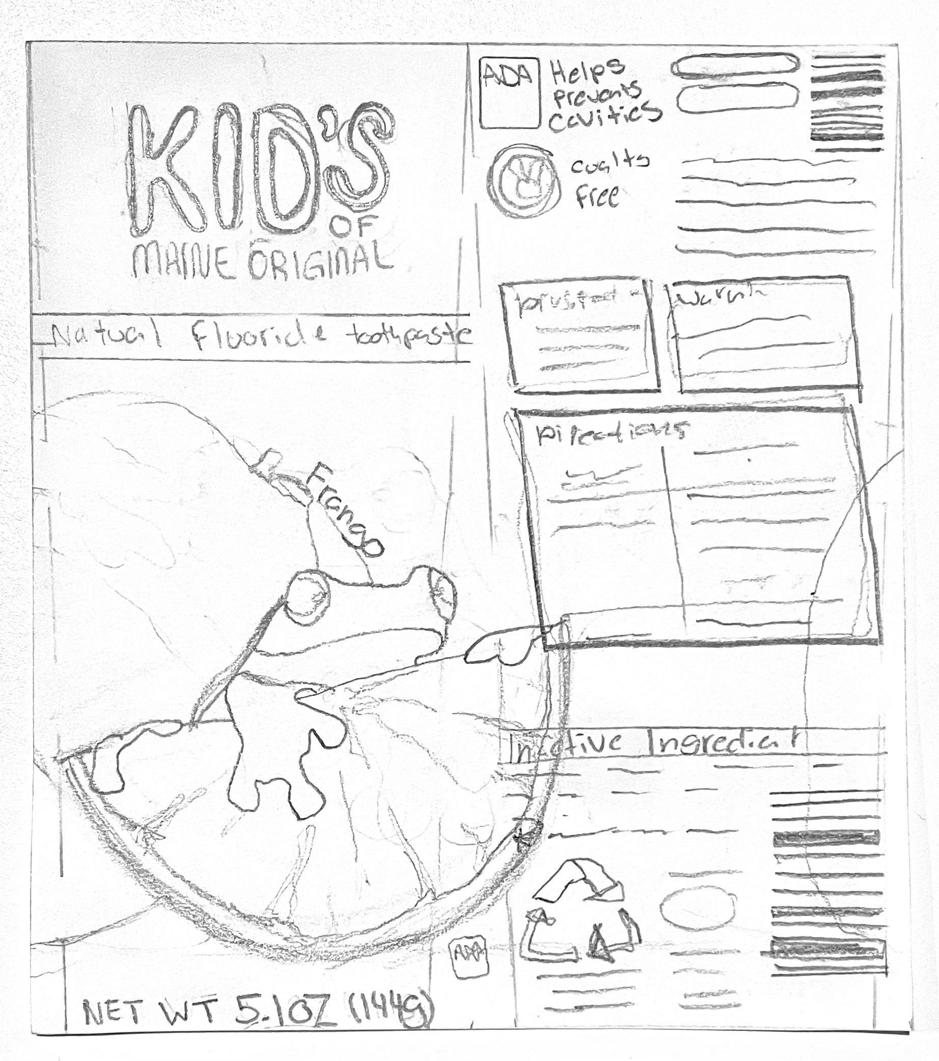
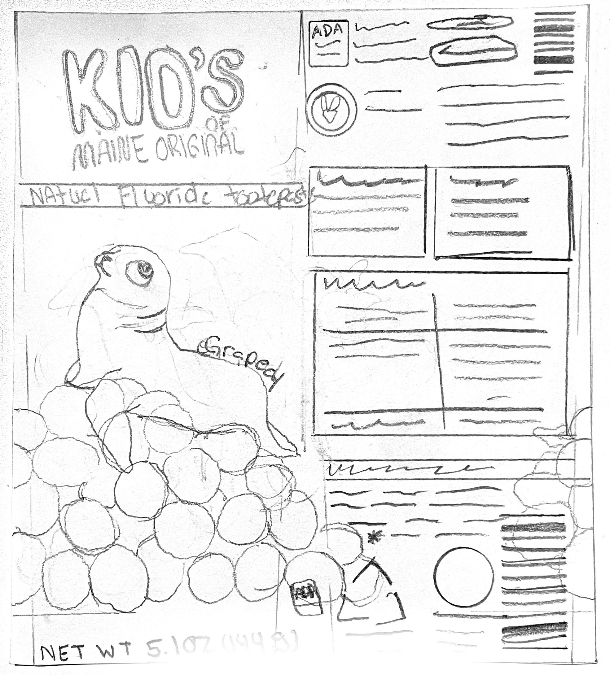
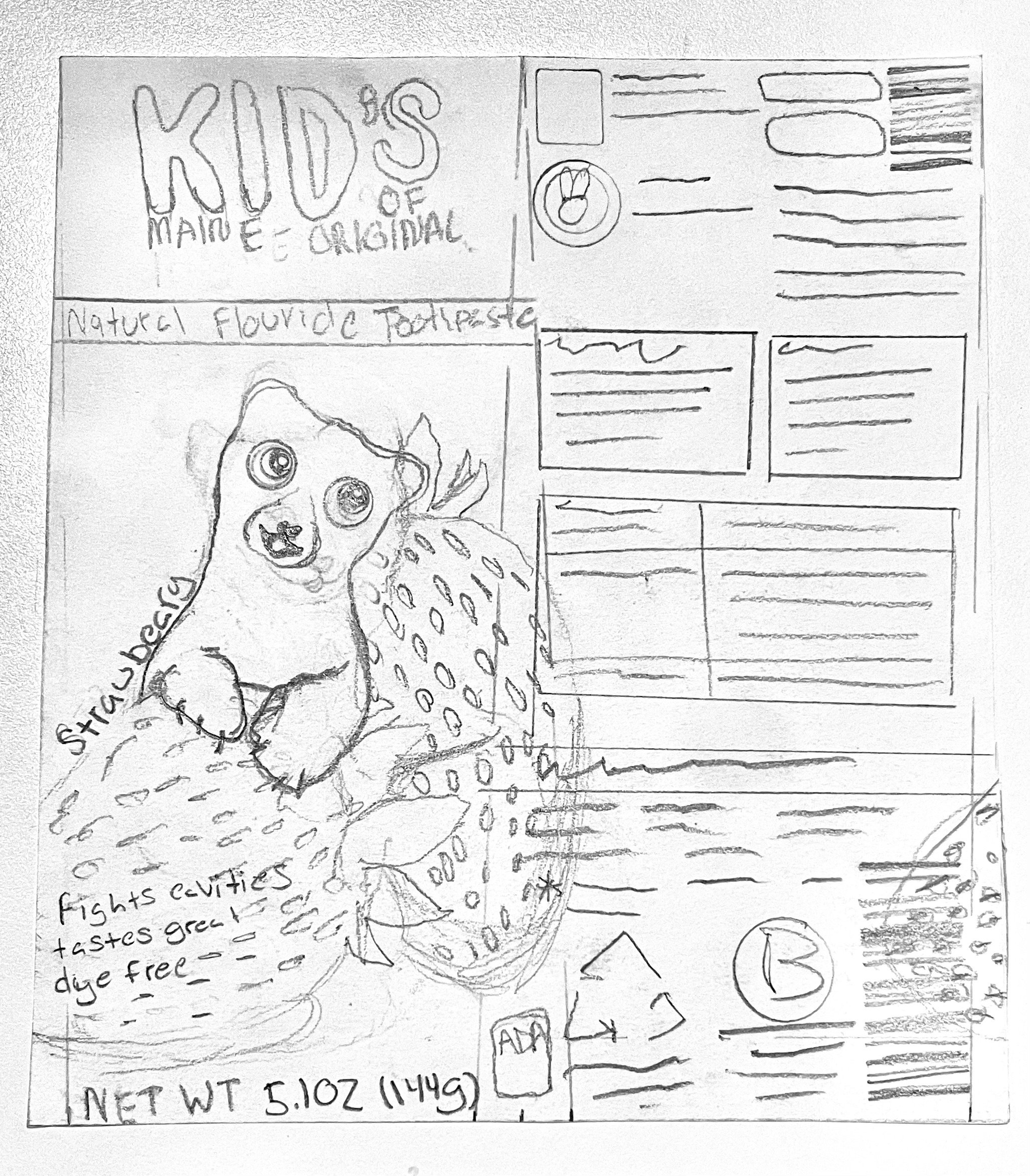
For the main logo I wanted it to be fund and blob looking. As though a kid took a fat marker and was tracing letters.
The Little things that make a big difference
Once the layout and colors where good I started refining the details of the logo, illustrations and badges.
The illustrations for this packaging are one of the most important elements. I drew all the illustrations to be similar to children’s books illustrations. Something simple and bright with a slight cartoon elements.


