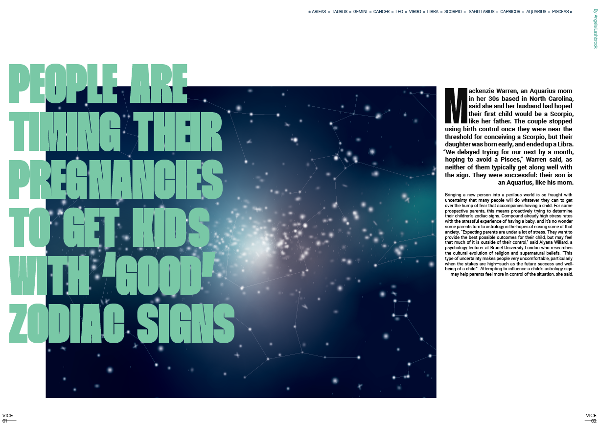
Vice article
Editorial and Typography design
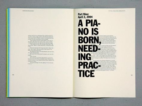
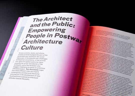
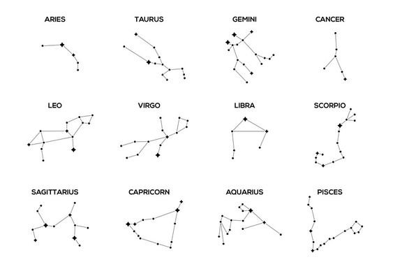
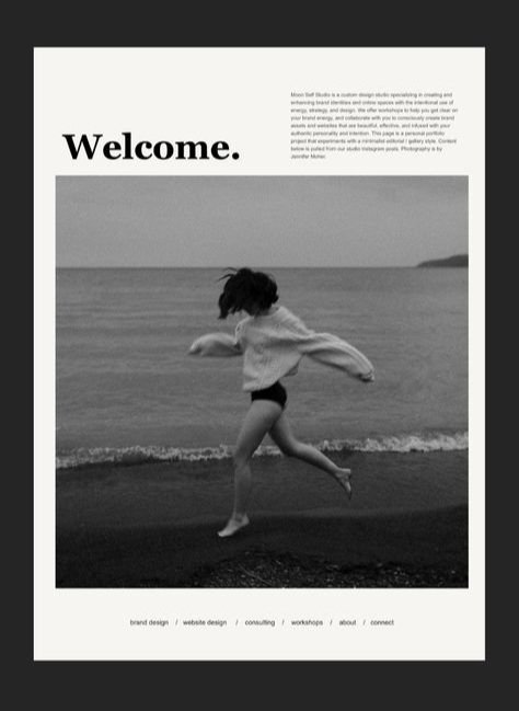
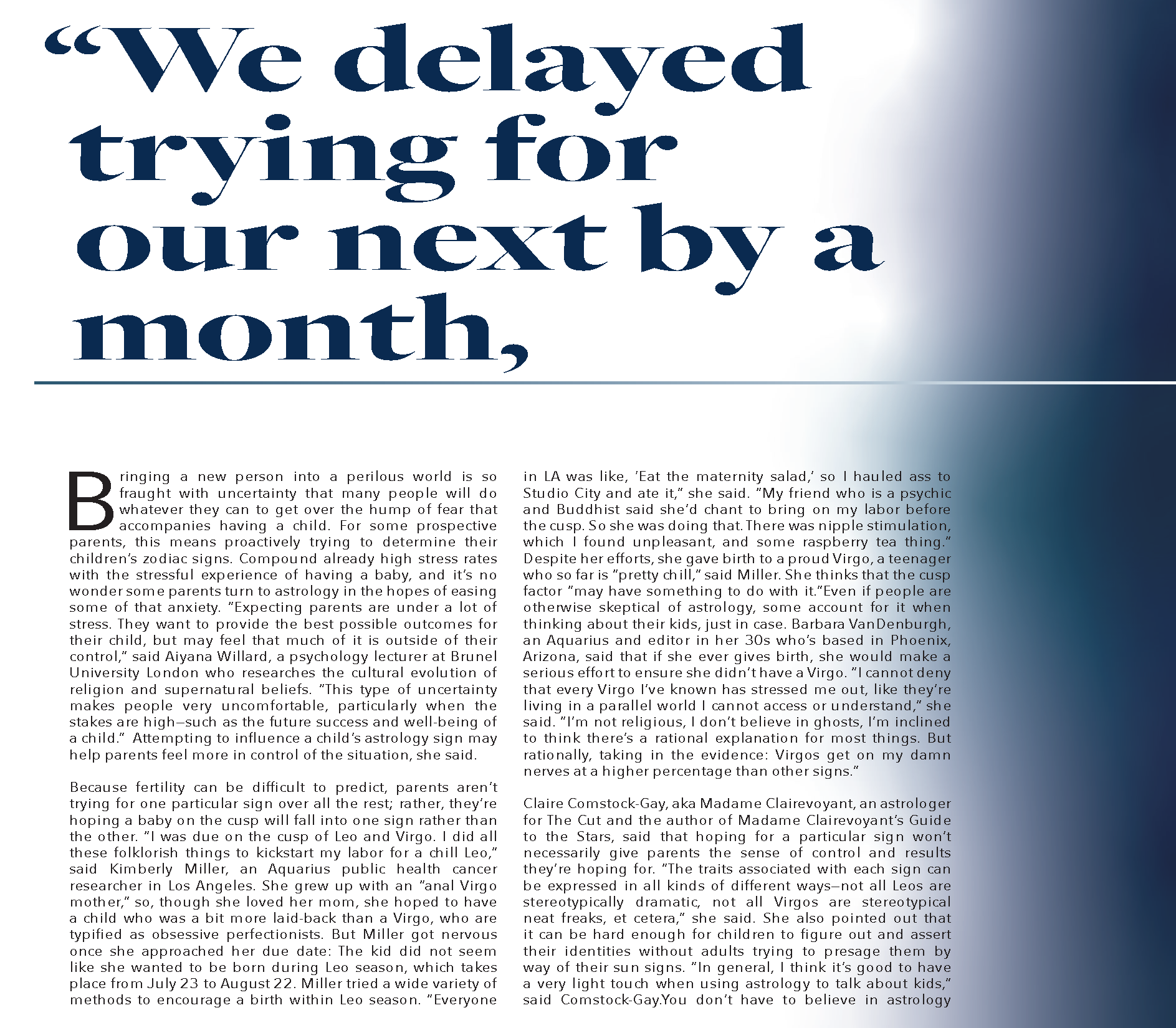
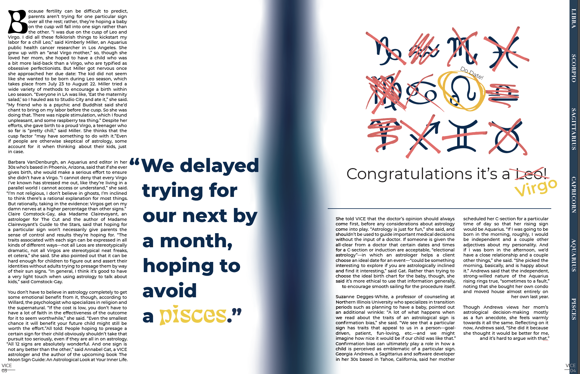
This is a 4 page spread for a Vice Article. This design features my editorial layout and typography skills. I did both the starts illuminations and the silhouette. I wanted people actually mistake the night sky on page 1 and 2 as a photo until they saw the small lines showing the constellations of the zodiacs. While I wanted the silhouette on page 4 to be simple in order to not take away from all the type it still needed to be impactful and strong.
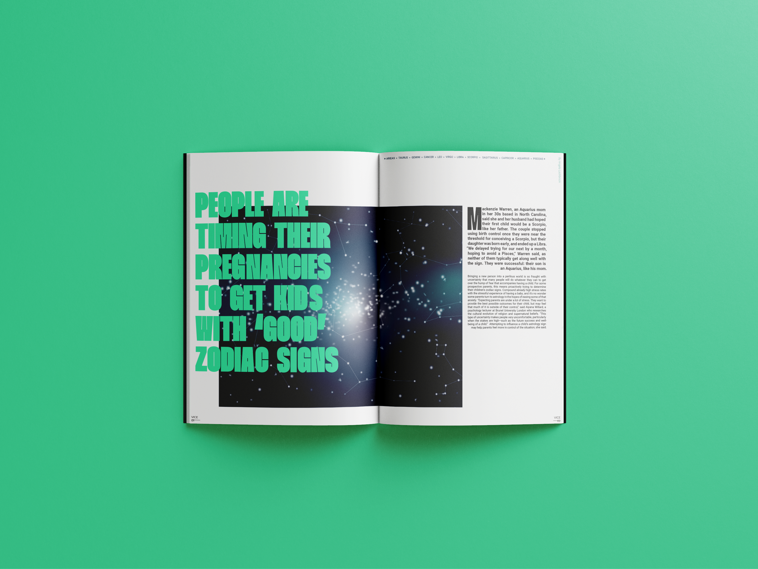


Night sky illustration for vice article with the zodiac constellations.
process
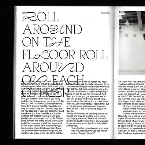




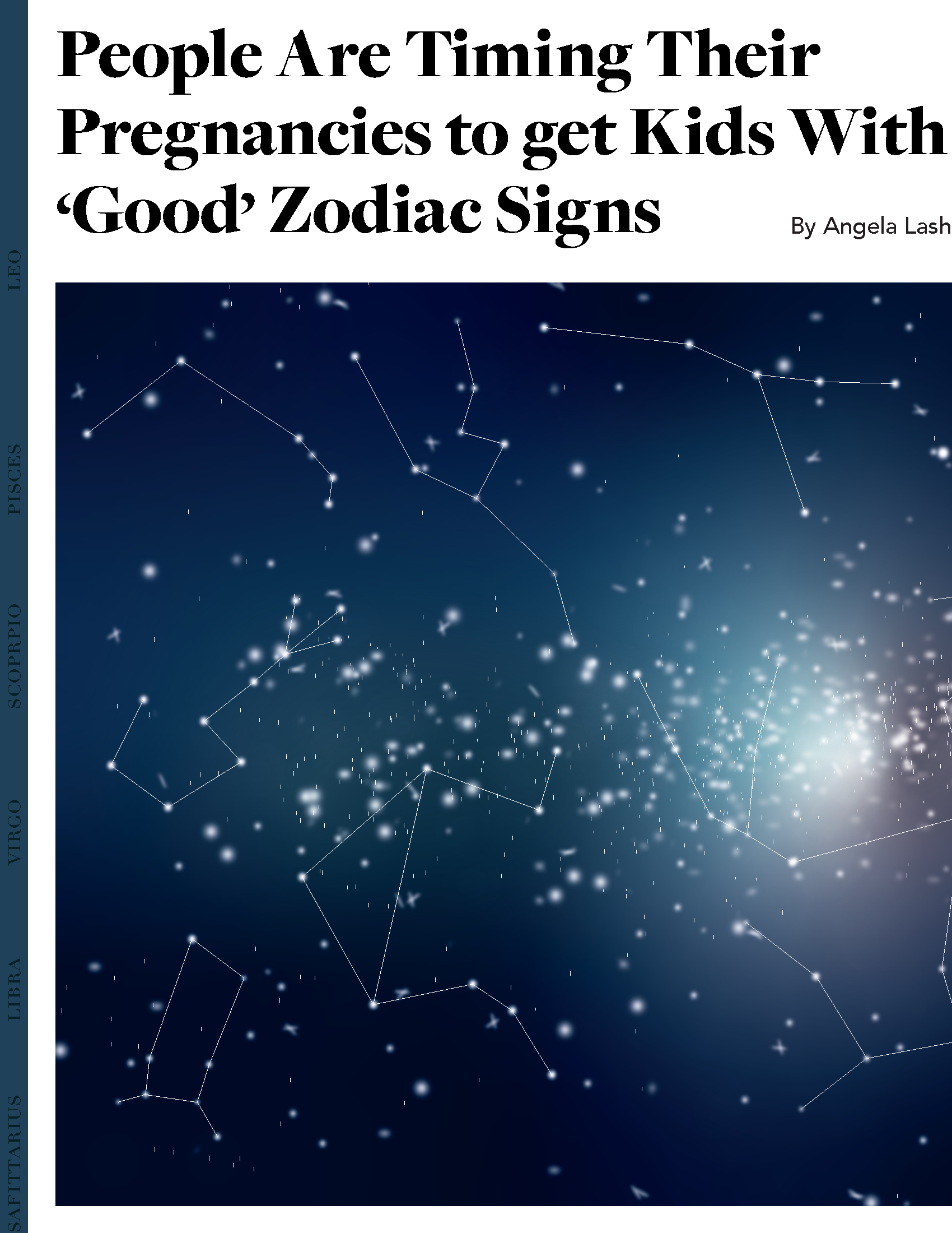
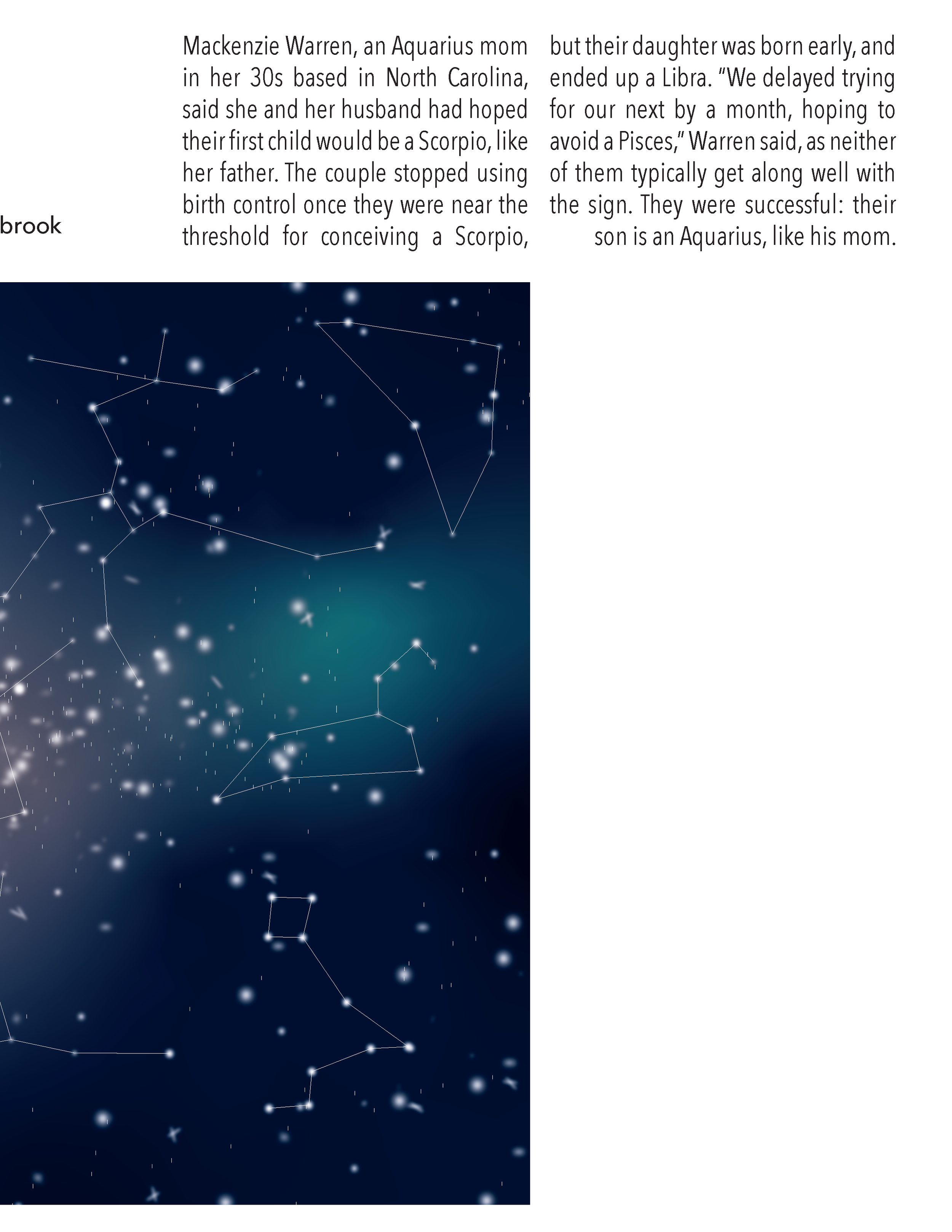
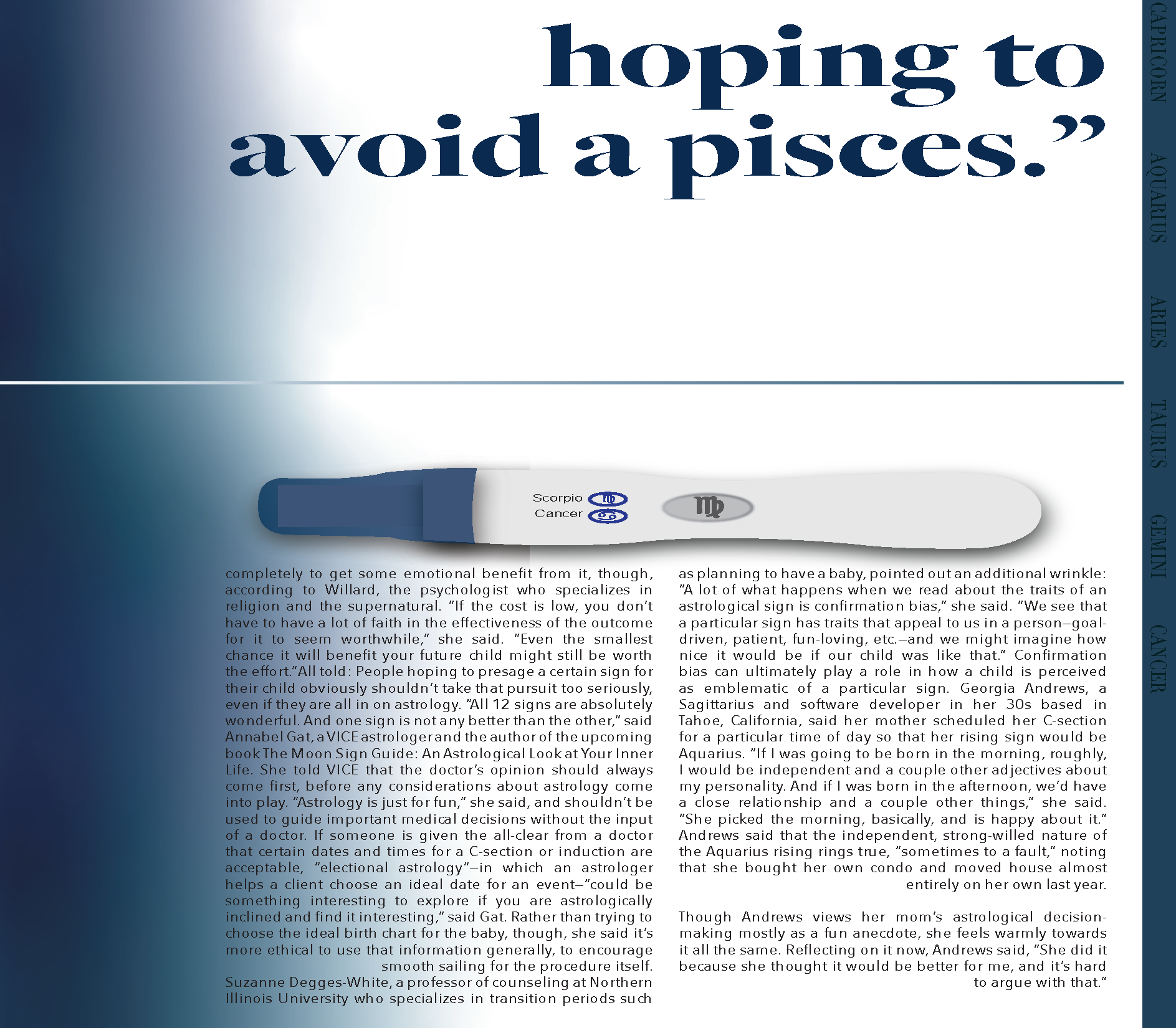
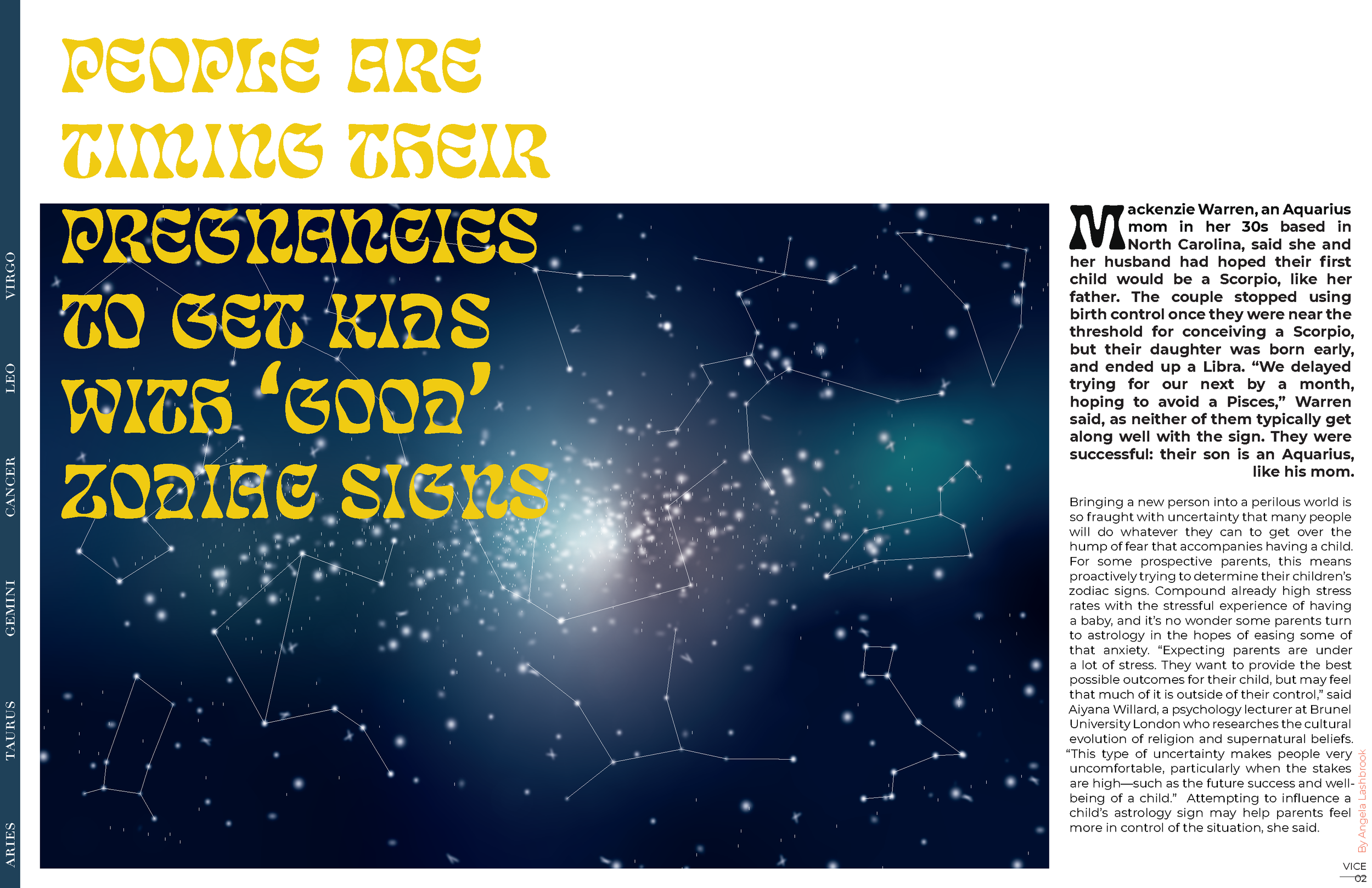
Page 1 and 2 of Vice Article
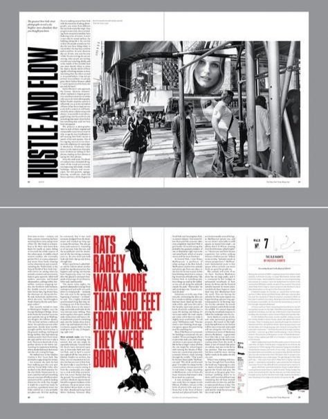
Page 3 and 4. Reader knows article is over because of stare at the end of the last quote. Which are also found at the top of the second page right before the article starts.
